Premium Coach Huub
How to Craft a Compelling Call-to-Action: 5 Key Strategies That Drive Instant Sales
Introduction
Did you know that the right call-to-action (CTA) can boost your conversions by up to 121%?
But here's the challenge: crafting a compelling CTA is easier said than done.
It’s not just about placing a button and hoping for the best.
To truly drive sales and engagement, your CTA needs to be strategically designed, well-worded, and placed for maximum impact.
The problem many businesses face is creating CTAs that stand out and compel action.
Simply asking for a sale isn’t enough; you need to convey value, clarity, and trust.
Without these key elements, your CTA could go unnoticed or, even worse, ignored.
What if you could create CTAs that instantly grab attention and drive results?
The secret lies in applying proven strategies that blend psychology, design, and ongoing optimization.
In this blog, you’ll uncover 5 powerful strategies to craft CTAs that not only drive traffic but also convert visitors into loyal customers.
These actionable tips will help you enhance your CTAs, boost your sales, and ultimately elevate your business growth.
Focus on the Benefits, Not Just the Action
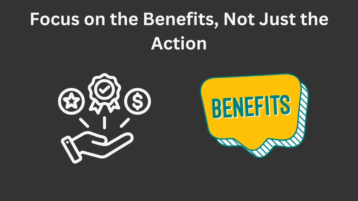
Instead of simply telling your audience what to do (e.g., “Buy Now”), focus on the benefits they’ll get from taking action.
This shifts the focus from the transaction to the value the customer will gain, making the CTA more enticing.
Why It Matters:
Focusing on benefits resonates with users by showing them how their life will improve, not just asking for a purchase.
It taps into emotional triggers that drive conversions.
How to Get There:
Think about the outcome your audience is after—whether it’s solving a problem, improving their life, or gaining something valuable. Use that as the core message in your CTA.
Pro Tip:
Use action-driven words that imply transformation, such as “Unlock,” “Get Access,” or “Experience,” to emphasize the benefit they will gain.
Use Eye-Catching Design and Placement

Use Eye-Catching Design and Placement
Your CTA needs to stand out visually.
This includes using bold colors, a clear font, and placing it strategically on the page to ensure it draws attention.
Why It Matters:
Even the best-written CTAs can be ineffective if they blend into the page or are hard to find.
A visible, well-designed CTA grabs attention and encourages users to click.
How to Get There:
Ensure the CTA contrasts with the rest of the content and is easy to spot.
Experiment with placement—whether it’s above the fold, in the middle of the page, or at the end—based on your design.
Pro Tip:
Use contrasting colors for your CTA button, like a bright color that stands out from the rest of your website's palette, to make it impossible to miss.
Be Clear and Direct with Your Message

Clarity is key.
A CTA should clearly communicate what the user will get by clicking it.
Avoid jargon or vague statements and get straight to the point.
Why It Matters:
When users are uncertain about what they’re getting, they’re more likely to abandon the action.
Clear CTAs provide confidence and make it easy for users to make a decision.
How to Get There:
Use simple, concise language that explains exactly what will happen when they click. For example, instead of “Click here,” try “Get Your Free Trial” or “Download the Guide.”
Pro Tip:
Use action verbs like “Get,” “Join,” and “Download” to create a sense of urgency and ownership.
Test, Refine, and Optimize for Maximum Impact

CTAs need to evolve.
Testing different versions, analyzing results, and refining your approach based on data will ensure your CTA performs at its best.
Why It Matters:
What works for one audience might not work for another. Testing allows you to fine-tune your CTAs for higher engagement and conversion rates.
How to Get There:
Run A/B tests with different wording, colors, button sizes, or placements.
Use analytics tools to monitor performance and make data-driven decisions.
Pro Tip:
Start with small tweaks and changes to gauge what resonates best with your audience. Even small adjustments can yield big results.
Leverage Social Proof and Testimonials

Including testimonials, reviews, or case studies in your CTA section can help build trust by showing that others have already benefited from what you're offering.
Why It Matters:
Social proof works because people trust the experiences of others more than marketing messages.
It reassures potential customers that they’re making a good decision.
How to Get There:
Incorporate real testimonials, client logos, or success stories directly on the page near your CTA to show evidence of real-world success.
Pro Tip:
Use specific, quantifiable results in testimonials (e.g., “Increased sales by 30% in 6 months”) to make your social proof more credible and persuasive.
Conclusion
Creating a high-converting call-to-action (CTA) is essential for driving sales, engaging your audience, and growing your business.
By focusing on the benefits, you shift the conversation from simply asking for an action to demonstrating the real value your audience will gain.
Eye-catching design and strategic placement ensure that your CTA gets noticed, while being clear and direct with your message eliminates any confusion and encourages immediate action.
Testing, refining, and optimizing your CTAs over time ensures that you’re always learning what works best for your audience, adapting to their preferences, and maximizing your results.
Additionally, leveraging social proof and testimonials helps build trust, reassuring potential customers that they’re making the right choice by clicking through.
When these strategies are combined, you’ll create CTAs that not only capture attention but also lead to real conversions.
Whether you’re aiming to grow your email list, increase sales, or drive more engagement, the right CTA is a game-changer.
Start applying these proven tactics today to see how they can elevate your marketing efforts and drive lasting success.
Ready to transform your CTAs and boost your sales?
Implement these strategies now and watch your conversions soar!
Frequently Asked Questions
A CTA is a prompt on a website, email, or advertisement that encourages users to take a specific action, such as "Buy Now," "Download," or "SignUp." It's a critical element of driving conversions and engagement.
The design of your CTA affects its visibility and effectiveness. A well-designed CTA uses bold colors, clear fonts, and strategic placement to catch attention and encourage clicks.
An effective CTA should be clear, concise, and focus on the benefit to the user. It should also include strong action verbs and be strategically placed to stand out visually.
You can A/B test different versions of your CTAs by changing the wording, design, button size, or placement. Analyzing these variations will help you understand what resonates best with your audience.
Using urgency in CTAs can be effective when appropriate. Phrases like “Limited Time Offer” or “Get It Before It’s Gone” create a sense of urgency that encourages users to take immediate action.
Social proof, like testimonials, reviews, or case studies, builds trust by showing potential customers that others have had positive experiences with your product or service. It makes your CTA more credible and persuasive.
Use action-oriented words like “Get,” “Start,” “Unlock,” or “Discover” to inspire action. Keep the message focused on the benefit the user will receive from clicking the CTA.
The placement of your CTA depends on your page layout, but it should be visible and easy to spot. Common placements include above the fold, in the middle of the page, or at the end of a section. Experiment with placement to see what works best.
By regularly testing and refining your CTAs, you can ensure they evolve with your audience’s preferences. Optimization involves experimenting with language, design, and placement to maximize engagement and conversion rates.
Yes! A well-crafted CTA can build trust when it is clear, benefits-driven, and reinforced by social proof. Clear messaging and providing value at every step help customers feel confident in their decision to click.